Ontario Ministry of Transportation
Building an Occupational Health Tracking Platform
to Improve Access to Health and Safety Data
How might we make exposure information more transparent and accessible?
Role
Team
Timeline
Prototyping
Usability Testing
Discovery Workshops
UX Designers
Product managers
Developers
May 2025 - Aug 2025
Overview
Problem Space
Context
My value add
Ontario workers are often warned about harmful substances but lack an acessible way to track and review exposures. Imagine having symptoms appear only after its too late. there was a clear problem to address.
The Ontario Ministry of Transportation planned to launch a self tracking tool that helps workers understand the substances theyre exposed to on the job. MTO follows a four phase design process (discover, alpha, beta, live)
I joined the project during the early prototyping phase (discovery/alpha), where I explored redesigns for the homepage, supported and led 15+ usability testing sessions, and synthesized findings into actionable insights
my work informed key revisions to the self tracking tool by aligning designs with testing data
Success metrics
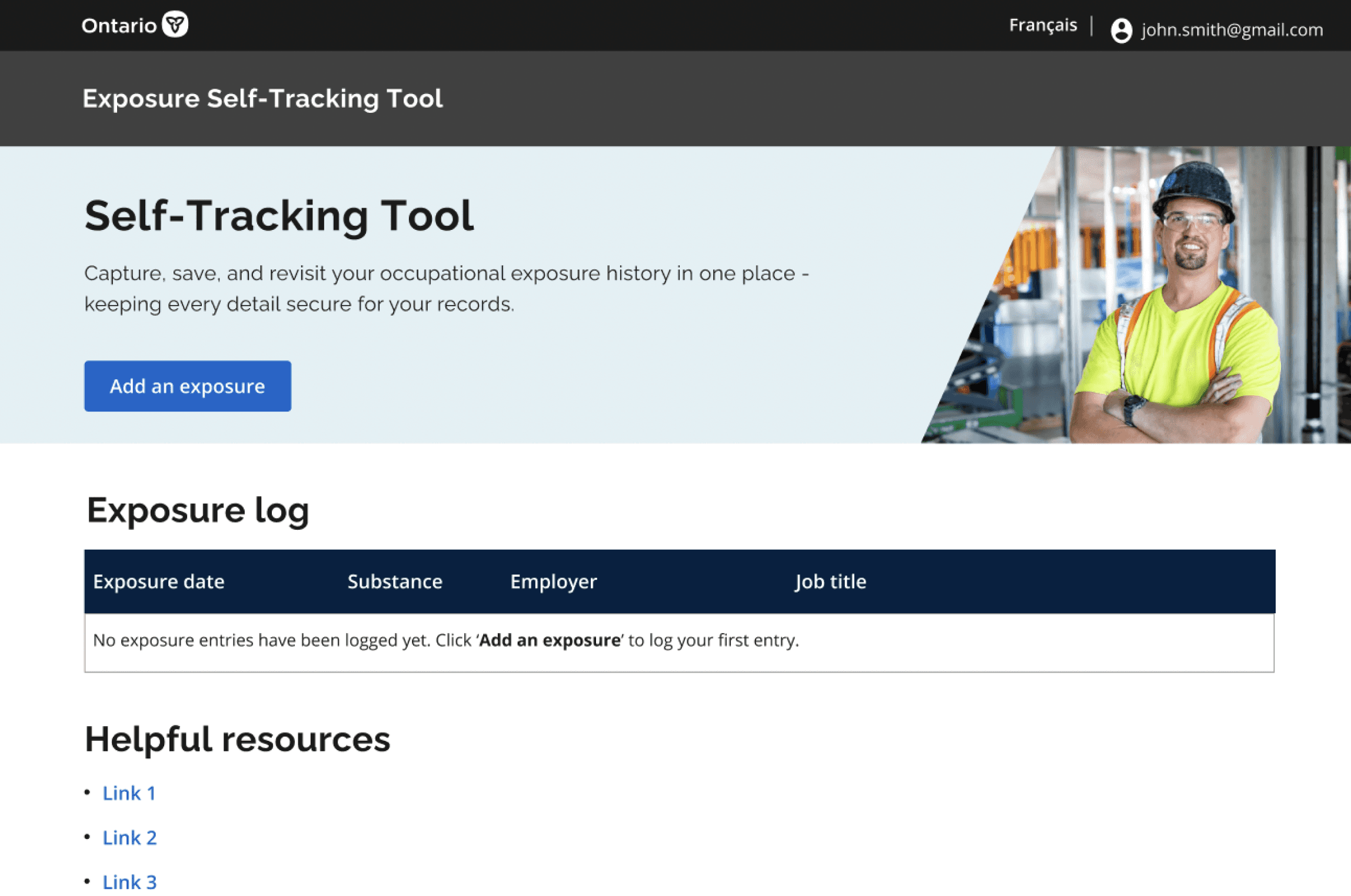
The original homepage wasn’t very intuitive for new users sign in was hard to find in the top corner, and there was no clear button to create an account. I redesigned the page to make these actions more prominent, moving them into a central, visible spot so new users can get started with ease.
The workers user journey
Success metrics
Early MVP designs
Workers are the main users, looking for clarity about potential exposures and safety on the job. The journey highlights moments where the tool should guide them, build awareness, and provide easy access to information.
Number of Daily Active Users
Tracking platform entry count
Form completion success rate
Click through rate on information links
We set success metrics early on to ensure everyone, from stakeholders to the design team, was aligned on the project goals.


Insights and synthesis
Managers want to scale the tool to guide workers
High risk jobs blur “expected” vs “unexpected” exposures
Exposure tracking relies on individual diligence
Dynamic sites make data capture inconsistent
We organized feedback from testing sessions into major themes, making it easier to see patterns across users. These themes guided which features of the MVP prototype we prioritized and refined.
Final Design
Final Design


Reflections and Next steps
Takeaways
Whats next?
Designing for accessibility
Testing the self-tracking tool with workers reminded me how important it is to design with clarity. Even small tweaks in language or layout made the tool feel more approachable and supportive.
Learning through workshops
Joining discovery sessions with engineers and product teams showed me how much stronger ideas become when different perspectives are in the room. Mapping out challenges together helped align everyone on what really mattered.
Turning feedback into action
Pulling together insights from testing and workshops taught me how to translate feedback into tangible design changes. It reinforced the value of iteration as a bridge between user needs and final designs.
The next steps involve broadening testing to include more diverse user groups and refining early prototypes into tools that can be used confidently in day-to-day work. Finding the balance between usability and practicality will guide how these designs continue to evolve.
The final designs came after several iterations of the MVP prototype. Each round of feedback and testing informed refinements in flow, layout, and clarity, leading to a solution that feels more intuitive and aligned with user needs.
Thanks for stopping by, I'd love to chat!